Bespoke Heritage Gift Range for Kailzie Estate
Tucked away just outside Peebles, down a quiet country road in the Scottish Borders, sits Kailzie Estate, a place that feels less like a visitor attraction and more like a hidden gem waiting to be discovered. With its beautiful gardens, charming café, woodland walks and peaceful atmosphere, it’s somewhere my family and I have enjoyed visiting for years.

So when Louise, one of the new owners of Kailzie Estate, got in touch about creating a bespoke heritage gift range for the estate’s reopening, it immediately felt like a very special project to be part of.
The collaboration actually came about after Louise spotted a bespoke range I had previously created for another local business whilst visiting a shop in Peebles called Head To Toe. A few locals had also recommended my work to her, and after an initial meeting at the estate to discuss ideas, products, and the direction of the recent rebrand, the project began to take shape.
We wanted to create a range of gifts that would sit beautifully alongside Kailzie Estate’s refreshed branding, strengthen the gift shop’s identity, and appeal to both visitors and tourists exploring the Scottish Borders. It was important that the design not only felt beautiful and distinctive, but also translated successfully across a wide range of products at different price points within the gift shop.
Finding the direction
Finding the direction
One of the things I loved most about this project was the huge amount of creative freedom. Aside from making sure the artwork complemented the estate’s rebrand, Louise trusted me to explore concepts and develop ideas organically. From the beginning, we knew flowers would play a prominent role in the artwork. The gardens at Kailzie are such an important part of the visitor experience, and I wanted the final design to feel vibrant, welcoming and full of life.
To gather inspiration and references, I visited the estate several times, taking photographs and notes, whilst also using some beautiful photography by local photographer Ian Linton as additional reference material.


A part of the design process I particularly enjoyed was drawing the different flowers. I drew them individually before pulling them all together as one big ‘sunburst’ bouquet. I added in green stems and leaves at the end to fill in any gaps.
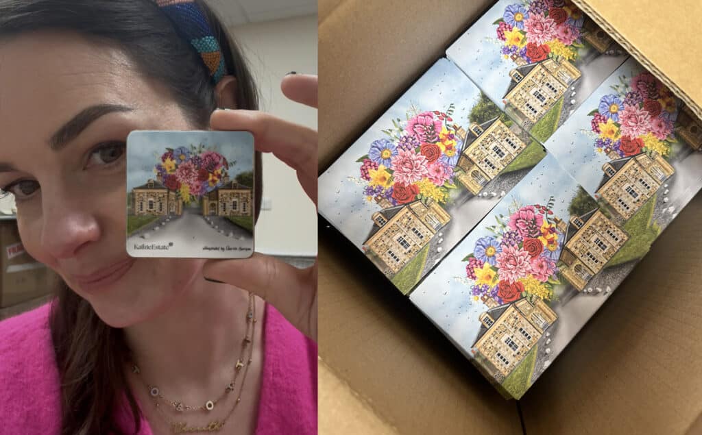
Drawing the 2 buildings took the longest, but once I got the outline and the main features (windows, gates) plotted in I enjoyed being able to fill in the brick work. I love the character old buildings like these possess, no two bricks are the same. One of the trickiest aspects was adapting the artwork to work across both portrait and landscape layouts. Adapting the design work as tea towels and art prints wasn’t difficult. However, products such as mugs and aprons required much more careful consideration to ensure the composition still felt balanced and striking.
The apron, in particular, became one of my favourite products from the range. Aprons can be surprisingly awkward to design for because of their unusual proportions, but I’m so pleased with how the final piece worked out.
The finished collection included:
- Tea towels
- Aprons
- Mounted art prints
- Bone china mugs
- Postcards
- Magnets

All products were manufactured in the UK using trusted suppliers I regularly work with. I handled everything from the artwork creation and product formatting to sourcing production quotes, arranging samples and designing packaging.
The products were digitally printed, with the mugs packaged in gift cartons and the linens carefully folded and wrapped in branded card sleeves to make a cohesive retail presentation.


Why projects like this are important
This project meant far more to me than simply designing products for a shop. Kailzie Estate holds many happy memories for my family: brunches with Gregg and the kids, garden walks, wine tastings, and family gatherings. It was also one of the last places my Mum visited before she passed away. My brother and I took her there on one of the days she had a little more energy, and I know she would have absolutely loved this collection. She would undoubtedly have bought five of everything, two for herself and three to gift to others.
Projects like this are the perfect blend of everything I love most: storytelling, illustration, heritage, flowers, architecture and creating meaningful products that help people connect with a place.
Seeing the final collection brought to life within the estate itself was incredibly rewarding, and it’s a collaboration I’ll always be proud to have been part of.